
I was going to title this “a tale of two spoons”, but I thought it might get the wrong kind of people clicking.
However, I’m going to use two spoons to demonstrate why you have to stop prioritizing form over function.
Constantly I see people making decisions based on how something looks rather than how something works. For some reason, far too many people will prioritize the appearance of something over it performing the intended function as effectively as possible.
In particular, I’m thinking about sales pages and products, where business owners seem to care more about whether the page or product looks just right, rather than if it does the job it’s meant to do.
First though, Uncle Chuckles is a man of his word.
I promised you spoons and I’m giving you spoons.
Before kicking on, just from the two photos above, which of those two spoons do you think is the better design?
Focus on form
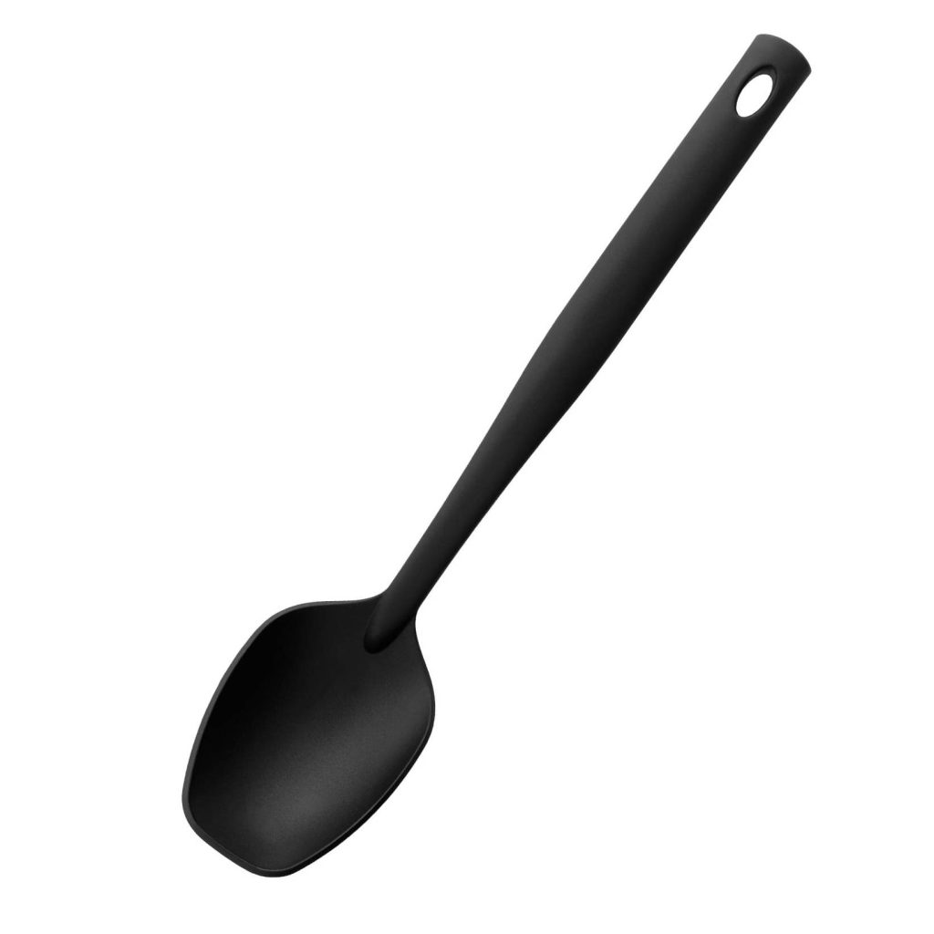
First up we have the Brabantia 365201. Positively trips off the tongue that name, doesn’t it? What can I say about this spoon, beyond its singularly unsexy name?
Well, it’s black. And spoon shaped. Oh and it’s got a hole for hanging.
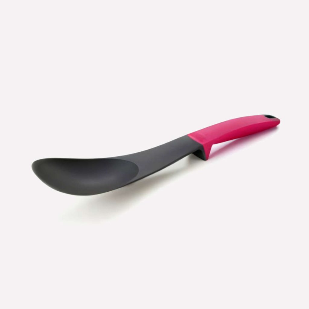
Our second spoon is the Elevate Spoon from Joseph and Joseph.
Note, the sexy name.
Now this is a rather more striking design that has some features I believe to be worthy of note.
To get the basics out the way, once more it is spoon shaped and it also has a hole for hanging.
Unlike the 365201, the Elevate Spoon has a contrasting color handle. A striking magenta, that is actually a softish, rubbery surface coating that feels extra grippy. This is not a spoon designed to be dropped.
Finally, let’s turn to the source of it’s name. Can you see in the picture how the spoon’s bowl is raised clear of the kitchen surface it rests on?
It’s been cleverly designed with a pivot point so that the weight of the handle keeps the spoon raised when placed on a surface. Meaning that you should be able to place the spoon down without getting the surface dirty while cooking.
Genius, no?
So which of these is the greater piece of design?
If we focus on form alone, then there’s no question that the Elevate Spoon walks away with the title.
It nails the basics, throws in a grippy handle and has the innovation of the balancing mechanism.
There’s more to design than just form though.
Focus on function
No doubt, dear reader, you noticed the authoritative tone with which I described both spoons. Uncle Chuckles has owned both of these spoons, which perhaps teases a taste of the glamour of life here in la maison Chuckles.
Please, let me share my fascinating spoon experiences with you.
In the hot pink corner
The Elevate Spoon looked great when Uncle Chuckles first laid his hands on it. Maybe it was Chuckles’ hands, but it didn’t stay that way for very long.
First though, let’s consider the headline feature of this spoon. Its elevate function.
Seems a super clever idea on paper, however, when used to stir anything more unctuous than a watery soup, the added weight of the sauce stuck to the spoon tipped the balance and it plonked down onto the surface just like any other spoon.
Even if it was just coated with a thin sauce or soup meaning it did elevate, after a few moments the sauce would drip from the spoon onto the surface anyway.
All round, the elevate function proved to be a big design fail.
As we all know, there’s more to being a spoon than just elevating, so onwards we go.
In fairness to Joseph Joseph, it may be that my Elevate Spoon wasn’t described as dishwasher safe. If that was the case, it seems absurd that anyone would make a modern kitchen spoon that shouldn’t be put it the dishwasher.
Either way Chuckles put his in the dishwasher and within a few months the striking hot pink color was already starting to fade. The spoon looked less impressive hanging on display.
I don’t know how long it took before the grippy handle surface started to break up and fall away from the handle in pieces, but it was certainly within the first year.
By that stage it also became apparent the spoon was formed of two pieces, as a gap started to open between the handle and spoon’s bowl. It could pushed back a little, but an ugly gap was always apparent.
Eventually, used to stir any sauce with a bit of body, the two parts would separate completely.
In the black corner
Which brings us to our second contender, the snappily named 365201 spoon.
On paper, this appeared a stupefyingly dull piece of design, but it outperforms the Elevate Spoon throughout.
Sure it doesn’t have the elevate feature, but we’ve already seen that most of the time, neither does the Elevate Spoon.
It also lacks the reassuringly grippy handle surface treatment. However, I’ve yet to experience any disastrous kitchen based incidents where the spoon has flown from my hand. Not even a minor incident where it slipped a little during vigorous stirring.
And trust me, Uncle Chuckles is a very vigorous stirrer.
Perhaps the plastic alone is grippy enough then.
Also, being formed of a single piece, Chuckles has no problems with the spoon splitting into two pieces during normal use. Granted, the surface of the plastic shows some wear now, but I anticipate it’ll continue to look much the same for many more years.
One last thing that further shows the contrast between the two spoons was particularly unexpected,
In the piccy, I think you can just make out that the Elevate Spoon has a very rounded bowl, which helps contribute to its attractive and friendly appearance.
The 365201 has a more blunted bowl. Initially that just seemed to be a visual design decision, but it becomes clear it’s more than that if you try to spoon something out of rectangular storage container.
The 365201’s bowl shape makes it much easier to get into the corners of a container compared to the rounded bowl of the Elevate Spoon. It’s not perfect, but the difference in use is dramatic.
Design isn’t about how something looks, it’s about how it works
Overall, while the Elevate Spoon appeared the greater piece of design at the outset, the 365201 spoon offers a superior user experience in every way.
While I’ve been talking about spoons, the same principles apply to any other form of design.
If you focus too much on what a sales page looks like, you may find it doesn’t do as good a job selling as a simpler page.
If you focus too much on what a product looks like, you may find it doesn’t serve users as well it could if you’d focused more on the content.
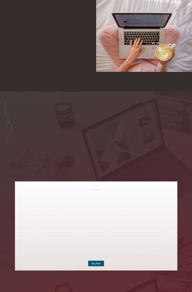
Let’s consider the following two mocked up pages.
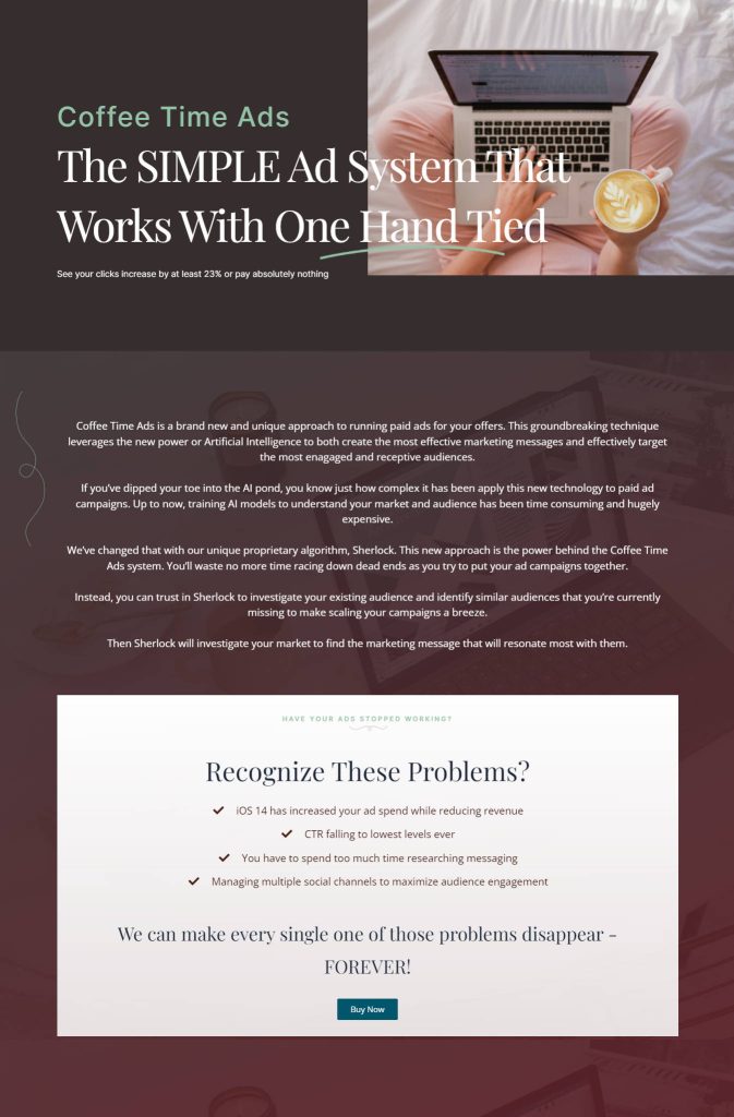
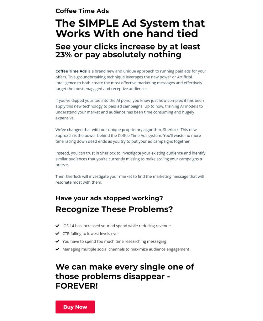
The first is probably more likely what most entrepreneurs would choose to create for their products. The second is just text, although that over-simplifies the design. It uses a hierarchy for heading sizes and different fonts for heading and body to help maximize the legibility of both.
Which do you think it the easiest to read?
Clearly it’s the plain black text on a white background. The first page falls into the trap of focusing on form over function and the readability of the page at all points suffers for it.
Don’t misunderstand me. I’m not saying that every sales page should look like the second. While, if either of those pages were to inspire you, the second would be a better source of inspiration, in practice my own opinion is that your pages should probably fall somewhere between them.
Making all sales pages black text on white would lead to every page looking the same and users would likely quickly become blind to them. Design elements can help pages to stand out and enhance the message, but they shouldn’t be added just because they look pretty.
The design should always be secondary. To try and highlight that further, consider these two mocked up pages.
How many sales do you think the first page might achieve leveraging nothing more than the page’s design? Exactly, without the copy, the design is pure tumbleweed.
At least the second explains what the product is. Using Google Docs for sales pages probably isn’t going to trend in a big way, but at least there is a chance of sales. The copy is what primarily makes a sales page successful.
Just in case you think that example goes a bit too far, last week I saw a Dov Gordon sales page that was almost purely video. There was a link if you wanted a written version of the sales pitch and that took you straight to Google Docs. So Google Docs sales pages are actually a thing – here’s the link in case it’s still active.
Don’t be a form junkie, focus on function
Great design isn’t about making something look super sexy.
Great design is about understanding the problem that needs to be solved and creating a solution that solves that problem as effectively as possible.
If you can make it super sexy at the same time, then you’re golden, but the sexiness level should come second.
When it comes to your sales pages, the problem you’re trying to solve is users viewing your pages and not buying.
Pretty flourishes don’t cut it.
Copy that engages and persuades is what will turn visitors into customers.
Prioritize your time on that function and only when you feel you’ve taken that as far as you can should you start to consider the form.